

Make it colourful!
Basic photo editing
Today, most smartphones can take high-quality photos, and they’re usually handy for taking photos in the vineyard, in the cellar or at events. But to get really spectacular pictures, it’s often worth making some adjustments to the original image.
Many people find these programs complicated, but anyone can easily learn the basic functions and achieve spectacular results compared to the original photo. There are plenty of free programs for editing photos, such as befunky.com’s PhotoEditor, which is also available online, so you don’t need to install anything on your computer.
Crop is the easiest tool to use, if something out of place is sticking out of the image, simply crop the image tighter and the result is clearer. You can also use the same tool to highlight a detail if your image is large enough. With resize, you can crop images to different proportions, choose between portrait or landscape mode, and use the rotate and straighten tools to correct any minor skew or add excitement by changing the horizon.

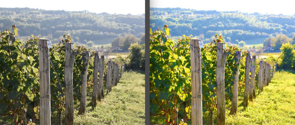
Colour management: since the rise of Instagram, everyone knows that you can manipulate colour to achieve very special effects. Of course, it’s important not to get carried away. It’s always worth adjusting brightness and contrast to make your images a little more vibrant. Highlights makes the lighter toned parts of the image lighter or darker, while shadows does the same for the darker parts of the image. In the colour menu, you can change the intensity of the colours, achieve completely different colours with hue, make them brighter or dimmer with saturation and adjust the colour temperature if you think the overall effect is too cold.
Sharpness: this is another one worth checking out, by using it you can highlight the thickness of fine details. However, you should do the editing at full size, because if you overdo it, the end result will be very grainy.
Frame: often we can make our image stand out from the crowd by giving it a frame. Again, stick to the basics, the simplest black or white frame is often the most effective, you can vary the thickness as you like and even round the corners.
The software has a lot more to offer, but it’s worth bearing in mind what everyone knows about wine: a lot of something doesn’t automatically mean it’s beautiful. It’s worth experimenting with the settings and if you find one you like, remember it and use it next time. That way, not only will your images be consistent, but so will the image of the winery. Of course, everything is based on the original photo, which we’ll cover in the next section.
László Burai